XHLUX
XHLUX
Two ceiling renders sit side by side on the review screen. The white linear light scheme reads quieter—the plane looks continuous, with fewer hard bars cutting across the field. The black scheme makes every housing edge, join and canopy readable even before anyone argues about lux.
That difference is mostly visual blend, not proof that white luminaires deliver different photometric uniformity on the workplane. White housings sit closer to common light-coloured commercial ceiling finishes—white paint, mineral fiber, gypsum board—so unlit housings, flanges and end caps do not announce themselves as contrast blocks.
On dark ceilings—including many open-structure ceilings—the relationship can reverse. This comparison assumes a light-coloured commercial ceiling where the goal is to reduce visual contrast.
This page explains why white linear light reads more visually blended into commercial ceilings—not a claim about photometric output, and not the black-finish design-statement approach covered in How to Choose Black Linear Lighting for Commercial Ceilings.
For the wider suspend / surface / recess map, start with How to Choose Linear LED Lighting: Suspended, Surface, or Recessed?—then return here for finish and form choices that help white linear rows disappear into the ceiling plane.
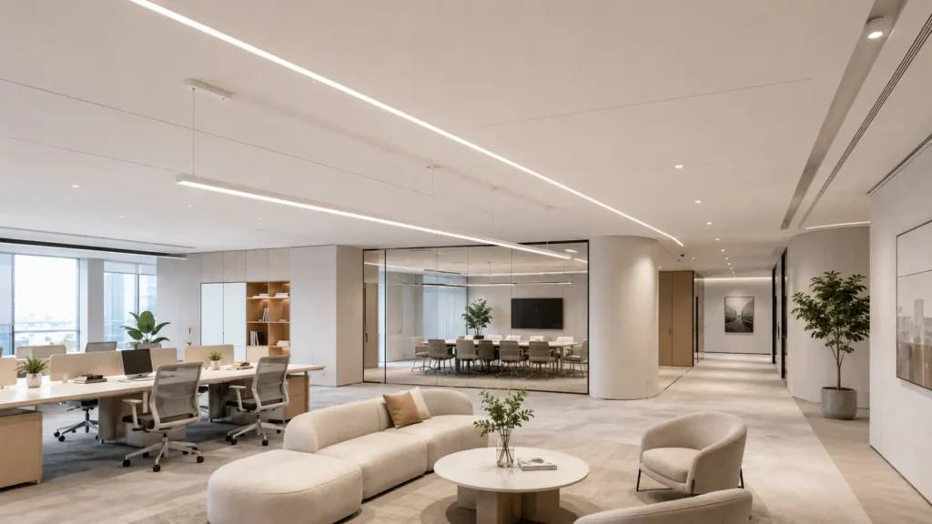
TL;DR: White linear fixtures often make a ceiling read more continuous because the housing colour matches the plane—not because the light engine magically flattens illuminance. Match finish tone to the real ceiling white, pick pendant forms with fewer visible breaks, choose mount types that hide housing edges, and know when a strip versus a complete fixture helps or hurts the blend.
Table of contents
- 🎨 1. Match finish tone to the actual ceiling white
- 💡 2. Pick pendant forms that keep the ceiling line quiet
- 🏢 3. Choose ceiling fixtures that hide the housing edge
- 🔗 4. Weigh strip versus complete fixture for seamless sightlines
- ✅ Visual blend at a glance
- What to do next
- 🏁 Conclusion
- FAQ
🎨 1. Match finish tone to the actual ceiling white
“White” on a datasheet is not one colour. Different white powder-coat finishes can have warm, neutral or cool undertones, and those differences become visible against white latex, mineral fiber and gypsum board—and against each other when the luminaires are switched off.
Visual blend starts when housing tone, diffuser plane and ceiling finish sit in the same family:
- Warm ceiling paint + cool-toned housing — the unlit housing looks grey-blue against cream board
- Board speckle + glossy housing — sheen catches light even when the fixture is off
- Join lines and end caps — a perfect bar colour with contrasting caps still breaks the plane
Hold finish samples against the actual ceiling mock-up—not a generic RAL swatch on screen. What matters is whether the bar edge disappears at a normal viewing distance when the row is off.
This is a visual read choice. It does not replace photometric design, spacing calcs or mock-up meter readings on the floor.
🎯 Does white linear automatically match every white ceiling?
No. Tone and sheen must match the board or paint family—otherwise white housing still reads as a stripe.
💡 2. Pick pendant forms that keep the ceiling line quiet
White linear pendant rows change how continuous the ceiling feels—not only when they are on, but in daytime renders and off-hours photos.
Forms that usually help visual blend:
- One continuous bar along an axis with minimal end-cap contrast
- Low-profile canopy colour matched to the bar and ceiling
- Fewer visible joins on the soffit line when viewed from normal occupant eye level
Forms that often break the blend:
- Short modules with dark gaps or hanger clusters between segments
- Overscale pendants that read as objects before they read as lines
- Mixed finishes—white bar, metallic canopy, black gripper
Uniform linear lighting on the ceiling plane here refers to visual continuity across the ceiling plane—not measured illuminance uniformity on the workplane. Continuous white bars on a white soffit simply show fewer visible edges when switched off than a broken module rhythm.
🎯 Do more pendant segments always improve flexibility?
They can—but each joint and canopy is another chance for the line to show. Choose segment count for access and shipping, then check the render with the fixtures switched off.
🏢 3. Choose ceiling fixtures that hide the housing edge
White linear ceiling fixture choices change how much housing you see against the plane.
| Mount type | Visual blend tendency | What still shows |
|---|---|---|
| Recessed | Trimless or low-contrast trim can reduce the visible housing outline | Slot width, trim edge if used, misaligned ceiling cuts |
| Surface | Full profile below the plane; edge and shadow line visible | Housing depth, bracket feet, join covers |
| Suspended | Bar and cable read under the slab | Canopy, drop, cable kit colour |
Recessed fixtures—especially trimless designs—can achieve very low visual contrast when the slot, housing finish and ceiling detail are coordinated. A proud surface bar in the correct white can still read as a ribbon if the ceiling is intentionally articulated.
Pick mount type for structure and maintenance first—then judge the unlit elevation. Blend fails when a white bar sits on the wrong plane with contrasting trim.
🎯 Is recessed always the most blended white linear option?
Often on a flat white ceiling—but poor trim contrast or wide slots can still read as lines. Surface or suspend in matched white can blend when the design expects a visible plane.
🔗 4. Weigh strip versus complete fixture for seamless sightlines
White LED linear strip systems and complete linear fixtures solve different visual problems.
In this section, the term refers to an LED strip installed within a white or trimless architectural profile—not simply a strip that emits white light.
Strip / channel paths can hide the light source behind a continuous diffuser or plaster-in reveal—good when the goal is a slot of light with minimal hardware silhouette. Risk: visible channel ends, driver boxes and access points if the detail is not drawn through.
Complete fixtures bring the housing, optics and joining system together as a coordinated luminaire package—easier to schedule, but flange width, join plates and end caps become part of the ceiling composition. A white complete bar with a sharp housing step can look more “present” than a trimless strip detail.
Neither is automatically more blended. Strip/channel details often blend well when the architecture supports a concealed source. Complete fixtures can work better when the project needs a defined luminaire edge with controlled finish, joins and accessories.
🎯 Does a white strip always disappear better than a white bar fixture?
Not always—trimless strip details can blend beautifully; a poorly joined white bar with loud end caps can look worse. Detail quality beats category labels.
✅ Visual blend at a glance
| Dimension | Usually blends better | Often shows on the ceiling |
|---|---|---|
| Finish tone | Housing and diffuser matched to board/paint family; low-contrast end caps | Cool-toned bar on warm ceiling; glossy housing on matte board |
| White linear pendant | Continuous white bar; matched canopy; fewer segments | Module gaps; contrasting hang hardware |
| White linear ceiling fixture | Trimless recessed or recessed with low-contrast trim | Proud surface profile; suspend cables on open view |
| White LED linear strip vs complete fixture | Trimless channel or plaster-in slot when detail is coordinated | Wide flanges, visible joins on complete bars |
This table describes visual read when fixtures are switched off or in render—not measured illuminance uniformity on the task plane.
What to do next
- Pull renders with fixtures switched off or photos with fixtures off—not only lit calculations.
- Match housing, diffuser and cap samples to the actual ceiling board or paint.
- Mark join count, canopy colour and mount type on the elevation before PO.
- Mock up one bay at normal viewing height and walk the sightlines.
Before you sign off on a white linear light, check:
- housing finish / RAL reference
- end-cap and joiner finish
- diffuser appearance
- recessed, surface or suspended mounting
- suspension cable and canopy colour
- fixture length and visible join positions
- trimmed or trimless detail
- physical finish sample approval
Triage:
- If the brief wants contrast and a design statement rather than blend, read the black-finish commercial ceiling guide linked in the boundary.
- If finish and form are set and you need mount-type depth, spacing or quote alignment, use the installation-parameter and quote-alignment guides in related posts below—not this page for photometric proofs.
- If the ceiling is a false-ceiling board system, check false-ceiling install notes on the related path before you cut tile.
If you are specifying white linear lighting for a commercial ceiling, send XHLUX your ceiling render, RAL/finish reference, mounting detail or fixture schedule. We can help review the housing finish, visible accessories, joins and mounting configuration before the final sample or bulk order.
🏁 Conclusion: Does white linear lighting read more uniform than black in commercial ceilings?
Back at those two renders, white often wins the quiet ceiling read on light-coloured fields—not because the luminaire outputs a flatter lux grid, but because white housings visually merge with white planes. Blend comes from finish tone, pendant form, mount type and strip-versus-fixture detail working together—not from the word “white” on the datasheet alone.
Explore our related blog posts:
- Surface-Mounted Linear Lights for Ceilings Without Recessing
- How to Choose Modern Linear Lighting for Offices and Retail in 4 Steps
- What to Know Before Installing Linear Lights in a False Ceiling
Technical Notes
- This draft describes visual blend and the visual appearance when the fixtures are off only. It does not claim that white linear luminaires deliver different photometric uniformity, efficacy or spacing results than black finishes on the same optic—those require project calculations and mock-ups.
- No universal reflectance percentages, LRV thresholds or “required white match” numbers are invented here. Finish decisions should use physical samples against the specified board or paint.
- Black-finish contrast and statement design stay on the black linear commercial ceiling guide linked in the boundary—not duplicated here.
- Structural, electrical, listing and accessibility rules still apply. Check local codes and the installation sheet before install.