XHLUX
XHLUX
A modern downlight does not make a ceiling modern by itself. A costly fitting can still look dated when the grid ignores the room, the source is glaringly visible or every trim competes for attention.
Use this page when the ceiling must look deliberate in a hotel, restaurant, retail space, office or high-end residence—not merely new on handover day.
Als de montagemethode nog niet vaststaat, begin dan hier:
→ Installatiemethoden voor LED-downlights: Inbouw versus opbouw versus verstelbaar
For the broader commercial specification sequence, use:
→ Commerciële LED-downlights: specificaties, selectie en OEM/ODM-handleiding voor B2B-projecten
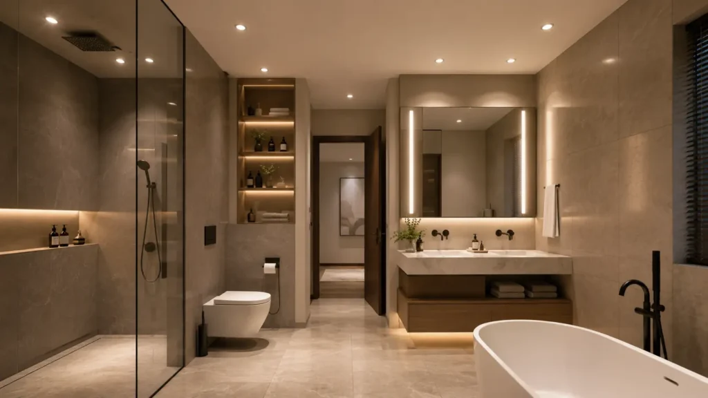
Kort samengevat: A ceiling looks current when the lights follow architecture, hide unnecessary brightness, keep a consistent visual language and remain serviceable. Reject decorative novelty that cannot survive a layout change, replacement cycle or full-scale sample.
1. A perfect grid that ignores the room
The fastest way to date a ceiling is to treat it as graph paper. Equal spacing may look orderly on a reflected ceiling plan while placing light between tables, behind displays or directly above people’s heads.
Start with fixed architecture and tasks:
- Walls, columns and ceiling joints
- Counters, tables, beds and displays
- Circulation and sightlines
- Vertical surfaces that need light
- Furniture likely to move
Then decide whether repetition helps the architecture. A disciplined grid can work in modular offices or retail bays, but it should align with real modules rather than an arbitrary room centreline.
The visual test is simple: temporarily hide the ceiling plan. If nobody can explain what each point illuminates, the grid is doing the designing.
🎯 What dates a downlight grid fastest?
A grid looks dated when its spacing is neat on paper but disconnected from architecture, tasks and normal sightlines.
2. Too many bright apertures in one view
Small fittings are not visually quiet when their luminous surfaces remain exposed. A ceiling filled with bright dots can dominate the room even when the trims are tiny.
CIE S 017:2020 defines glare through unsuitable luminance distribution, luminance range or extreme contrasts. CIE 117:1995 also treats observer position and viewing direction as part of discomfort-glare evaluation.
That matters because a deep recess, baffle or controlled optic changes source visibility. It does not merely change the product silhouette.
Review the ceiling from entrances, seated positions and long corridors. Renderings viewed only from standing eye height often conceal the worst view.
Do not approve “anti-glare” as a label. Request photometry, source dimensions and a lit sample at the intended output and viewing angle.
🎯 Is a smaller aperture always less visible?
No; a small high-luminance source can attract more attention than a larger, better-shielded luminous opening.
3. One trim shape used as decoration everywhere
A round, square or rectangular trim should support the ceiling language. Repeating a fashionable shape without reference to joints, panels or furniture can turn the ceiling into a pattern catalogue.
Goed contemporary recessed lighting usually limits the number of visible ideas. For example, a square trim can align with ceiling tiles while a round aperture sits more quietly in an uninterrupted plaster surface.
Shape also affects replacement. A distinctive bezel that disappears from the supply chain is harder to substitute without making one ceiling point visibly different.
Approve the face dimensions, cut-out, recess depth and replacement strategy together. The visual shape is only the final few millimetres of a much larger assembly.
🎯 Should every room use the same trim shape?
Only when one shape suits the ceiling modules, visual hierarchy and replacement plan across all those rooms.
4. A fashionable finish that fights the ceiling
Black trims can appear crisp against a dark ceiling and conspicuous against white plaster. White trims can disappear—or create a ring when the factory finish and ceiling paint do not match.
A modern ceiling downlight style needs a finish schedule, not a mood-board adjective. Record colour reference, gloss level, texture, bezel width and the approved ceiling sample.
Metallic finishes demand the same discipline. Brushed, polished and painted surfaces respond differently to daylight, grazing light and cleaning.
Do not judge a loose fitting on a table. Mount it in the real ceiling material beside sprinklers, sensors, speakers and access panels. The neighbouring hardware decides whether the light belongs.
🎯 What is the safest trim colour?
The safest finish is the one approved against the real ceiling, adjacent hardware and expected replacement batches.
5. Minimalism reduced to “make it smaller”
A minimalist downlight design is not simply the smallest aperture in the catalogue. It removes visual noise while preserving useful light, thermal performance, installation tolerance and maintenance access.
Very small apertures can introduce trade-offs:
- Higher source luminance
- Tighter cut-out tolerances
- Less room for shielding
- Smaller aiming mechanisms
- More concentrated heat paths
- Harder access to remote components
Trimless construction can reduce the visible border, but it transfers precision to the plaster and installation sequence. A damaged edge or poor alignment is more noticeable precisely because the detail is meant to disappear.
Specify the smallest fitting that performs the job and can be installed repeatedly—not the smallest diameter that looks impressive in a sample case.
🎯 Does minimal always mean trimless and tiny?
No; minimal means controlled visual information, which may require a visible trim, deeper optic or larger serviceable assembly.
6. Matching fixture spacing but ignoring beam rhythm
Ceiling rhythm and light rhythm are different. Two fittings can be equally spaced while their beams create bright pools, dark gaps or uneven wall scallops.
CIE 232:2019 notes that non-uniform LED source luminance can complicate glare prediction. ISO/CIE 8995-1 likewise treats light quality, glare, colour and delivery—not illuminance alone—as parts of a useful indoor environment.
Compare the exact optic at the scheduled mounting height. Use photometric files to review horizontal and vertical light, then test critical materials in a representative area.
The right-hand plan is not automatically correct. Its advantage is that every point has a stated relationship to a table, vertical surface or route that can be checked.
🎯 What should set the visual rhythm?
Architecture and illuminated targets should set the rhythm; equal fixture spacing is only one possible result.
7. Choosing novelty without a replacement plan
A trendy downlight fixture can date fastest when its appeal depends on an unusual bezel, proprietary module or one short-lived finish.
Ask what happens when one unit fails in year five. If the replacement changes aperture brightness, trim colour or dimensions, the ceiling reveals the substitution immediately.
Freeze these items after the representative sample:
| Rekening | Approve when | Warning sign |
|---|---|---|
| Indeling | Each point has a target or architectural role | Grid copied before furniture and elevations |
| Source control | Normal views avoid exposed high luminance | “Anti-glare” appears without evidence |
| Trim | Shape aligns with ceiling language | Shape is decorative but unrelated |
| Finish | Real ceiling sample and batch are approved | Finish chosen from a screen image |
| Scale | Aperture, output and service access agree | Smallest visible diameter wins automatically |
| Optic | Photometry and sample show useful overlap | Spacing is set without beam data |
| Replacement | Module, driver and visible parts have a plan | One failure requires a visibly different fitting |
For repeated rooms, record the approved SKU, optic, CCT, finish, driver and control settings. A design stays coherent only when procurement protects the sample.
XHLUX or another project supplier should be asked to reproduce the approved visual and technical schedule, not merely offer something described as “modern.”
🎯 What makes a modern detail age well?
It ages well when its appearance, performance and replacement path remain coherent after installation and later servicing.
Wat moet ik nu doen?
- Mark the architectural lines, furniture, vertical targets and important views before drawing ceiling points.
- Use the installation-methods guide linked in the introduction to freeze recessed, surface-mounted or adjustable construction.
- Use the commercial guide linked in the introduction to coordinate photometry, driver, finish, sample and procurement evidence.
- Build one representative ceiling area and review it from standing, seated and entrance sightlines.
- Keep Gidsen voor LED-downlights per ruimte en toepassing as a plain-text routing reference until that page is publicly available.
- Ask XHLUX or another shortlisted supplier to lock the approved visual and technical schedule before repeated production.
Noten en bronnen
- International Commission on Illumination — CIE S 017:2020, International Lighting Vocabulary: definition of glare and lighting terminology.
- International Commission on Illumination — CIE 117:1995, Discomfort Glare in Interior Lighting: observer position, viewing direction and the Unified Glare Rating framework.
- International Commission on Illumination — CIE 232:2019, Discomfort Caused by Glare from Luminaires with a Non-Uniform Source Luminance: limitations associated with non-uniform LED source luminance.
- International Organization for Standardization and International Commission on Illumination — ISO/CIE 8995-1, Light and Lighting—Lighting of Work Places—Part 1: Indoor: quantity and quality of indoor lighting, including glare and colour considerations.
- Final design approval still requires the exact ceiling, photometric data, finish sample, control gear and maintenance plan for the project.
![Hoe monteer je inbouwspotkappen: stapsgewijze handleiding [2025]](https://www.xhlux.com/wp-content/uploads/2025/07/How-To-Fit-Downlight-Covers-560x560.webp "Hoe monteer je inbouwspotkappen: stapsgewijze handleiding [2025]")