 XHLUX
XHLUX
A daylight LED downlight can make fine detail and pale surfaces look crisp, but that does not make it the right choice for every functional room.
Daylight white is a colour appearance, not proof of higher lumen output, better visibility or better colour rendering. The decision must start with the task, surfaces, glare risk and hours of use.
For a direct comparison of two common project CCTs, use:
→ LED Downlight 6500K vs 4000K: Which Color Temperature to Use?
If construction type is still open, start with the installation-method hub:
→ LED Downlight Installation Methods: Recessed vs Surface Mount vs Adjustable
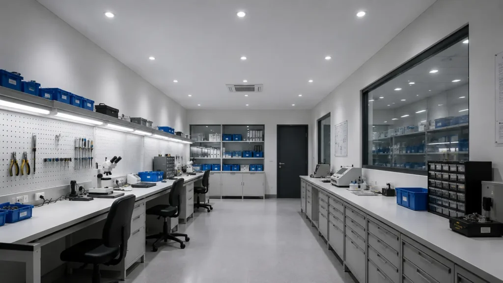
TL;DR: Use daylight LED downlights where accurate detail recognition, clean-looking surfaces and a clearly functional atmosphere matter. Avoid treating 6500K as a shortcut for brightness. Test it against real materials, screens and occupied sightlines before approving it for offices, hospitality spaces or long-duration work.
1. First separate colour appearance from brightness
Correlated colour temperature describes the appearance of white light. It does not state how many lumens leave the luminaire or how much illuminance reaches the task.
CIE S 017:2020 defines correlated colour temperature through the chromaticity nearest a Planckian radiator and expresses it in kelvin. The definition does not turn a higher kelvin value into a higher-output lamp.
Two downlights can share the same wattage and lumen output while looking different because one is 3000K and the other is 6500K. Two 6500K products can also deliver different light levels.
This distinction matters when a supplier describes a daylight white color temperature as “brighter.” It may appear crisper beside warmer light, but the photometric file and measured task level must prove the output.
For lumen planning, read:
→ How Bright Should LED Downlights Be? A Lumen Guide by Room
🎯 Does 6500K produce more lumens than 4000K?
Not by definition; CCT describes colour appearance, while the exact luminaire data must state lumen output and delivered illuminance.
2. Where daylight LED downlights work well
Daylight-white light is strongest when the room has a clear functional purpose and users need to distinguish edges, marks, dirt or small components.
Good candidate zones include:
- Inspection benches and quality-control points
- Utility, cleaning and preparation rooms
- Workshops handling small parts
- Back-of-house storage and stock checking
- Clinical or technical support spaces where the project brief permits it
- Short-duration service areas with pale, neutral finishes
A daylight downlight for task lighting works best when the beam is directed at the task rather than spread indiscriminately across the whole room. Local task light can provide the crisp effect without forcing every surrounding surface to 6500K.
White laminates, stainless steel and cool grey finishes can look clean under a controlled daylight-white source. Test coloured labels, skin tones, timber and food before assuming the same result.
🎯 Is daylight white suitable for every workshop?
No. It can support detailed work, but glare, shadow, colour discrimination and the required light level still depend on the exact task and layout.
3. Where daylight white often goes wrong
The same crisp appearance can become visually severe when the room is intended for rest, hospitality or long conversations rather than inspection.
Use caution in:
- Bedrooms and guest rooms
- Restaurants, lounges and hotel seating areas
- Timber-rich retail or residential interiors
- Reception areas designed to feel warm and calm
- Mirror-lined rooms and polished display spaces
- Mixed-CCT ceilings where adjacent fittings visibly disagree
Daylight-white light can make warm paint, wood and fabrics look flatter or cooler than the design sample suggested. It may also increase the visual contrast between the bright aperture and a darker ceiling.
The problem is using 6500K without a task-based reason, then finding that the completed room feels more clinical than intended.
🎯 Is 6500K automatically too cold for an interior?
No, but it needs a clear functional purpose and a material test; atmosphere-led rooms usually demand a more restrained CCT decision.
4. Check glare and screens before approving the ceiling
High CCT does not create glare by itself. Glare depends on source luminance, aperture size, beam control, position, background brightness and the viewer’s line of sight.
However, a bright daylight-white aperture can feel more conspicuous in a dark ceiling or dim room. The risk grows when narrow beams create bright pools beside darker surrounding surfaces.
Computer work needs special attention. OSHA’s Computer Workstations guidance warns that excessive lighting and reflections on screens can reduce visibility and contribute to eyestrain. It recommends controlling direct and reflected glare rather than simply increasing overhead light.
A cool daylight recessed lighting layout should therefore be checked from seated eye level. Look for visible LEDs, reflections on monitors, polished desks and high contrast between work surfaces and their surroundings.
Use deeper-recessed optics, shielding or local task lighting where they improve comfort. Colour temperature alone cannot solve a glare problem.
🎯 Can a lower-CCT lamp fix a glaring downlight?
It may change the sensation, but real glare control requires better shielding, position, beam distribution and balanced surrounding brightness.
5. CCT cannot prove how colours will look
Two sources at the same 6500K can render products, graphics and skin tones differently. CCT describes the colour appearance of the light, not the complete spectral interaction with objects.
CRI remains common in specifications, but one average number can hide important differences. ANSI/IES TM-30 provides a broader framework for evaluating colour fidelity and gamut, while current IES guidance encourages specifiers to consider colour rendition through each design phase.
For colour-critical work, request:
- Exact CCT and colour-tolerance data
- General CRI and relevant special indices where required
- TM-30 information when the project warrants deeper colour evaluation
- Spectral data for demanding display or inspection tasks
- A production-representative sample
- Confirmation that dimming does not create unacceptable colour shift
View the sample on the actual materials. A white test card cannot reveal what happens to timber, food, textiles, printed colours or human faces.
🎯 Does a 6500K label guarantee accurate colour rendering?
No. CCT identifies the appearance of white light, while colour fidelity and gamut require separate product data and material evaluation.
6. Use the room schedule, not one building-wide CCT
One CCT is easy to schedule but ignores how differently rooms are used. An inspection zone and a customer lounge do not share the same visual job.
Build the schedule by activity:
| Space or task | Daylight-white suitability | What to verify |
|---|---|---|
| Short inspection task | Often suitable | Detail visibility, colour rendering, glare |
| Cleaning or utility room | Often suitable | Surface visibility and uniformity |
| General office with screens | Conditional | Reflections, aperture brightness, user comfort |
| Retail display | Conditional | Brand colours, materials and product appearance |
| Reception or hospitality | Often unsuitable as the only layer | Atmosphere, skin tones and finish warmth |
| Bedroom or lounge | Usually a weak default | Relaxation goal and evening use |
Mixed CCTs can work across a real boundary, such as front-of-house versus back-of-house. Random mixing within one visual field usually looks like a coordination error.
If tunable white is considered, confirm the control range, scene logic, driver protocol and commissioning responsibility. A selectable-CCT switch hidden above the ceiling is not the same as an actively tunable system.
🎯 Should every task area use the highest available CCT?
No. Select the CCT that supports the task, materials, comfort and operating hours, then prove performance with the exact fitting.
7. Approve a sample under real project conditions
A useful approval method is a small mock-up using the proposed ceiling colour, mounting height, optic and target materials. Catalogue images cannot reproduce the finished contrast.
Compare at least two candidate CCTs while keeping the luminaire family, beam and output as consistent as possible. Otherwise, a change in optic or lumen package may be mistaken for a colour-temperature preference.
Review the mock-up from normal occupied positions and at the expected time of use. Record:
- Visibility of the actual task
- Direct view of the aperture
- Reflections in screens and polished surfaces
- Appearance of skin, products and finishes
- Contrast between task and surroundings
- Consistency between sample fittings
- Dimming and control behaviour
Do not approve only from a phone photograph. Camera white balance and display settings can change the apparent difference between CCTs.
Daylight white is one input, not the verdict
The diagram is a specification check, not a photometric calculation. CCT and light quantity must remain separate inputs until the complete visual result is reviewed.
Use a 6500k downlight application only when its task benefit survives the sample test. If a lower CCT achieves the same visibility with better material appearance and comfort, the higher number has not earned its place.
What to do next
- Define the task before selecting the CCT.
- Separate colour appearance from lumen and lux requirements.
- Shortlist daylight white only where it offers a clear functional benefit.
- Check screens, glossy surfaces and occupied sightlines.
- Compare colour-rendering data, not CCT alone.
- Approve a representative sample on the real materials.
- Ask XHLUX or another project supplier for photometry, colour data, driver compatibility and batch-tolerance evidence before production.
- Compare daylight-white decisions across offices and other spaces in LED Downlight Guides by Room and Application.
Notes & Sources
- CIE S 017:2020, International Lighting Vocabulary, provides the technical definition of correlated colour temperature.
- CIE TN 013:2022 explains terms related to Planckian radiation temperature and their limits of application.
- ANSI/IES TM-30 provides a method for evaluating light-source colour rendition beyond a single CCT value.
- OSHA Computer Workstations guidance identifies excessive light and screen reflections as glare risks that should be controlled through layout and shielding.
- External authorities are identified as plain text only. No external website receives a clickable link.


![How to Make a Concealed Spotlight Flush With the Ceiling: Best Guide [2026]](https://www.xhlux.com/wp-content/uploads/2026/09/How-to-Make-a-Concealed-Spotlight-Flush-With-the-Ceiling-Best-Guide-20261-560x560.webp "How to Make a Concealed Spotlight Flush With the Ceiling: Best Guide [2026]")