
Table of contents
- The Fastest Way to Make a “Premium” Space Feel Wrong
- What Is LED Color Temperature?
- Why LED Color Temperature Matters in Commercial Lighting
- Understanding Common LED Color Temperature Ranges
- Chart 1: “Professional, Low-Risk” Kelvin Map for Commercial Projects
- Choosing LED Color Temperature by Commercial Area
- Chart 2: Commercial Area → Recommended Kelvin
- Why One Color Temperature Is Often a Mistake
- How LED Downlights and Track Lights Support Professional Color Temperature Design
- Common Color Temperature Mistakes in Commercial Lighting
- Chart 3: Multi-CCT Zoning Strategy (The “Professional, Not Risky” Way to Mix Kelvins)
- How to Choose the Right LED Color Temperature for Your Project
- Comparison Table: “Which Kelvin Should I Choose?” by Fixture Type
- FAQ About led color temperature for commercial lighting
- 1) What LED color temperature is best for commercial lighting?
- 2) Is 4000K good for commercial spaces?
- 3) Should retail lighting be warm or neutral?
- 4) Can different color temperatures be mixed in one project?
- 5) Does color temperature affect customer experience?
- 6) What matters more: Kelvin or CRI?
- 7) Why do my lights look inconsistent even though they are all “3000K”?
- 8) Do I need dimming for color temperature control?
- Conclusion
- Business inquiries are welcome
The Fastest Way to Make a “Premium” Space Feel Wrong
A commercial space can have beautiful finishes, high-end furniture, and expensive lighting fixtures—and still feel uncomfortable the moment people walk in. Often, the problem isn’t the lumens, the beam angle, or even the layout. It’s LED color temperature.
Choosing the wrong color temperature can make commercial spaces feel cold, yellow, or inconsistent with their intended function—hurting comfort, branding, and perceived quality.
Many projects struggle because lighting looks “too blue,” “too warm,” or mismatched from one area to another. Retail displays lose appeal, hospitality spaces feel less relaxing, and offices cause fatigue. When color temperature is wrong, teams often attempt fixes by dimming or swapping a few fixtures—only to discover the entire space feels inconsistent, which can lead to expensive revisions.
The professional approach is to treat color temperature as a zoned design decision: driven by space function, user behavior, viewing distance, surface materials, and lighting layers (downlights vs track lights). Once you understand the logic, you can choose “professional, low-risk” Kelvin values and avoid the common mistake of using one color temperature everywhere.
This guide explains the “why” behind Kelvin choices, gives practical ranges by commercial area, and shows how to apply multi-CCT strategy using Faretti a LED da incasso E LED track lighting.
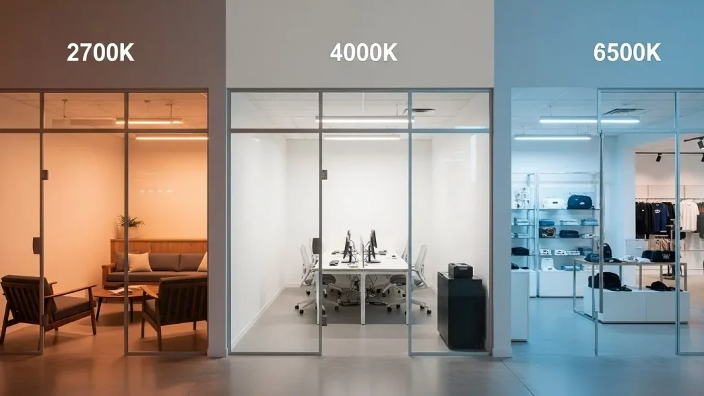
What Is LED Color Temperature?
LED color temperature describes the appearance of white light, measured in Kelvin (K). It does not describe brightness. Two lights can be equally bright but look very different—one warm and cozy, the other cool and crisp.
- Warm white feels more yellow/amber (lower K)
- Neutral white looks balanced and clean (mid K)
- Cool white looks more bluish (higher K)
If you want a neutral technical definition, see Wikipedia’s definition of color temperature.
What is LED color temperature?
LED color temperature describes the color appearance of light, measured in Kelvin (K), ranging from warm white to cool white.
Color temperature is not a “style preference”—it’s a performance parameter
In commercial lighting, Kelvin affects:
- user comfort and perceived “quality”
- attention and focus
- dwell time (retail/hospitality)
- product appearance and material rendering
- perceived cleanliness and modernity
- how consistent the space feels across zones
That’s why professional commercial lighting design treats Kelvin as a risk variable—not a decorative choice.
Why LED Color Temperature Matters in Commercial Lighting
Color temperature changes how people emotionally read a space—and how they behave inside it.
1) Mood and behavior (hospitality vs retail vs office)
- Warm white (2700K–3000K) supports relaxation, intimacy, and “premium comfort.”
- Neutral white (3500K–4000K) supports clarity, cleanliness, and professional balance.
- Cool white (5000K+) supports alertness and high-visibility tasks—but can feel clinical in customer-facing spaces.
2) Visual comfort and fatigue
Color temperature interacts with glare and brightness distribution. A cool, high-contrast lighting setup can feel harsher than a warm, well-layered setup—even at the same measured lux.
For comfort context, many professionals reference indoor lighting comfort standards such as EN 12464-1
and glare terminology like UGR (Unified Glare Rating).
(Office projects commonly target UGR<19 as a comfort benchmark; other commercial spaces may not specify UGR formally but still benefit from low-glare design logic.)
3) Color quality: CRI and consistency become more visible when Kelvin is wrong
Even a “correct” Kelvin choice can fail if the light has poor color rendering or inconsistent color bins. In professional commercial projects—especially retail and hospitality—common targets include:
- CRI >90 (and Ra97 for premium retail/hospitality)
- SDCM <3 for tight color consistency across fixtures
- stable CCT over time (avoids the “different whites” problem later)
Why is color temperature important in commercial lighting?
Because it affects mood, comfort, product/material appearance, and how people interact with the space—often determining whether a project feels professional or “off.”
Understanding Common LED Color Temperature Ranges
Most commercial decisions fall into three useful buckets.
Warm White (2700K–3000K): Comfort, Hospitality, and “Premium Calm”
How it feels: warm, inviting, relaxed
Best for: restaurants, lounges, hotel guestrooms, boutique hospitality, spa-like areas
Risks if overused: can feel dim/dated in task-heavy zones if color rendering or brightness layering is poor
Neutral White (3500K–4000K): Balanced, Clean, Professional
How it feels: natural, crisp but not harsh
Best for: retail general lighting, lobbies, offices, multi-purpose commercial areas
Why it’s common: safest commercial baseline—especially 3500K or 4000K when combined with good glare control and high CRI
Cool White (5000K+): High Visibility, Alertness, Special Use
How it feels: very bright, clinical, “daylight-ish”
Best for: certain back-of-house tasks, workshops, special inspection zones
Risks: easily feels uncomfortable in hospitality and brand-focused customer areas
What are common LED color temperatures for commercial lighting?
Most commercial spaces use warm (2700K–3000K) or neutral white (3500K–4000K). Cool white (5000K+) is typically reserved for special functional zones.
Chart 1: “Professional, Low-Risk” Kelvin Map for Commercial Projects
Think of Kelvin as a functional dial. The same Kelvin does not fit every zone.
| CCT Range | Light Character | Best Use Cases | Common “Fail” When Misused |
|---|---|---|---|
| 2700K | very warm, intimate | fine dining, lounges, luxury guestrooms | can feel too dim/yellow in retail task zones |
| 3000K | warm, premium, comfortable | hotels, restaurants, boutique retail accents | can look “flat” if CRI is low |
| 3500K | warm-neutral balance | lobbies, casual dining, mixed-use retail | can feel inconsistent if mixed randomly |
| 4000K | neutral, clean, professional | offices, retail general lighting, corridors | can feel harsh if glare is not controlled |
| 5000K+ | cool, high visibility | task/service areas, special zones | feels clinical in hospitality, hurts ambiance |
This table is not telling you “pick one.” It’s showing you why multi-zone design is often the professional answer.
Choosing LED Color Temperature by Commercial Area
This is where decision-makers want clarity. The key is aligning Kelvin with function + behavior + brand.
Retail Stores: Clarity + Attraction (Not “Cold White Everywhere”)
Retail lighting is about product visibility E visual hierarchy. A professional approach often uses neutral white for base clarity and slightly warmer accents to add richness.
Recommended strategy
- General ambient (ceiling/base): 3500K–4000K
- Accent on key products: 3000K–3500K (especially for fashion, leather, premium goods)
- Beauty/cosmetics: often benefits from high CRI and carefully tuned neutral (frequently 3500K–4000K), validated with real product tests
Why this works
- neutral base keeps the store clean and professional
- slightly warmer accents can make products feel more premium and dimensional
- high CRI prevents “washed-out” product colors
For retail accents and flexible highlighting, many projects rely on LED track lighting, and for beam flexibility in changing displays, zoomable track lights can reduce rework when merchandising changes.
Hotels & Hospitality: Comfort First, With Zoned Clarity
Hospitality is the classic case where one Kelvin is often a mistake. Guestrooms, corridors, lobbies, and public areas serve different emotions and tasks.
Recommended strategy
- Guestrooms: 2700K–3000K (relaxation, premium comfort)
- Corridors: 2700K–3000K or 3000K–3500K depending on brand tone and safety needs
- Lobbies/public areas: 3000K–3500K (welcoming but still clear)
- Back-of-house/service zones: can move toward 4000K where task clarity matters
Why this works
- warm zones support relaxation and night comfort
- slightly higher Kelvin in lobbies improves clarity and “freshness”
- zoning prevents the hotel from feeling either too yellow or too cold
For comfort-sensitive hospitality zones, glare control and stable optics matter as much as Kelvin. That’s why hospitality base lighting often uses glare-controlled LED spot downlights with consistent binning (SDCM<3) and high CRI.
Restaurants & Cafés: Atmosphere Is Built by Brightness Layers + Kelvin Control
Restaurants prove a crucial point: Kelvin alone does not create ambiance. Ambience comes from layered brightness and accent hierarchy. But Kelvin still sets the emotional baseline.
Recommended strategy
- Dining area (fine dining / lounge): 2700K–3000K
- Casual dining: 3000K–3500K (comfortable, social clarity)
- Café / bakery: 3500K–4000K (product clarity + energy), but prioritize CRI >90 / Ra97 for food rendering
- Bar zones: often 2700K–3000K with controlled highlights and decorative layers
Why this works
- warm CCT supports intimacy, especially at night
- cafés need more energy and product clarity
- food and skin tones demand high color rendering; otherwise warm light can look dull and unappetizing
Restaurants commonly combine adjustable accent layers (track spots on tables, features) with stable ambient layers. Explore track lighting for accent control and downlights for a comfortable ambient foundation.
Offices & Workspaces: Professional Clarity + Visual Comfort (UGR Matters)
Offices are task environments, so neutral white is common. But glare and comfort determine whether people can work comfortably for long durations.
Recommended strategy
- General office areas: typically 4000K (clean, focused, professional)
- Meeting rooms: 3500K–4000K (slightly warmer can feel more human for long meetings)
- Collaboration / lounge office zones: can use 3000K–3500K for comfort if it aligns with the brand
Comfort requirements
- Many office specifications aim for UGR<19 to reduce discomfort glare.
- Pair Kelvin choice with proper optics and glare control design—Kelvin cannot fix glare.
For office-type public areas, ambient layers can be supported by LED linear lighting while task and accent zones can be handled by downlights and track systems.
What LED color temperature is best for commercial spaces?
It depends on the function of each area: warm for comfort-focused zones, neutral for task-oriented zones, and a zoned approach for mixed-use projects.
Chart 2: Commercial Area → Recommended Kelvin
| Area | Recommended Kelvin | Why It’s “Professional & Low-Risk” |
|---|---|---|
| Fashion retail (base) | 3500K–4000K | clean, true color baseline, strong visibility |
| Fashion retail (accent) | 3000K–3500K | adds richness and premium warmth to key items |
| Hotel guestrooms | 2700K–3000K | relaxation and night comfort |
| Hotel corridors | 2700K–3500K | comfort + safe navigation; brand-dependent |
| Hotel lobby | 3000K–3500K | welcoming but clear and “fresh” |
| Fine dining | 2700K–3000K | intimacy, premium mood |
| Café/bakery | 3500K–4000K | energetic clarity; food looks best with high CRI |
| Office general lighting | 4000K | focused, professional clarity |
| Meeting rooms | 3500K–4000K | balance comfort + concentration |
| Back-of-house tasks | 4000K–5000K | task visibility where ambiance is secondary |
Why One Color Temperature Is Often a Mistake
Commercial projects are not single-purpose environments. Even inside the same store or hotel, user behavior changes by zone.
The “one Kelvin everywhere” failure pattern
Using one CCT across an entire project often produces one of these outcomes:
- Too cold for comfort zones
A hotel guestroom or restaurant feels clinical if forced into 4000K+ everywhere. - Too warm for task and clarity zones
Retail circulation, service zones, or signage can look muddy if forced into 2700K everywhere. - No visual hierarchy
When every zone shares the same CCT and the same brightness layer, the space becomes flat. In retail and hospitality, flatness reduces perceived quality. - Mismatch becomes visible as the project scales
Long corridors, large stores, and multi-floor projects magnify tiny differences. That’s why SDCM<3 matters so much: even if you choose the correct Kelvin, inconsistency across fixtures can make the project feel unprofessional.
Should commercial projects use one color temperature?
Usually no. A zoned, multi-CCT strategy improves comfort, function, and visual hierarchy—while reducing rework risk.
How LED Downlights and Track Lights Support Professional Color Temperature Design
You don’t select Kelvin in isolation. You select Kelvin with lighting layers.
Downlights: Stable baseline for “the space’s default white”
Faretti a LED da incasso are typically used to establish the ambient foundation:
- corridors, circulation, general illumination
- clean ceiling aesthetics
- consistent baseline CCT across large areas
They are ideal for keeping one zone consistent (e.g., corridor at 3000K, office ambient at 4000K).
For commercial-grade outcomes, prioritize:
- low glare architecture (deep cut-off, controlled optics)
- CRI >90 / Ra97 where premium rendering matters
- SDCM <3 for fixture-to-fixture consistency
- lifetime and reliability targets like L70/B50 50,000 hours
- thermal stability via die-cast aluminum heatsink
- smooth optics (often PMMA lens) and stable LED engines like COB chip for clean beam behavior
- practical efficiency target: 100–130 lm/W (application and optics dependent)
Explore comfort-focused options in LED spot downlights.
Track lights: Kelvin as a merchandising and hierarchy tool
Faretti a LED are a powerful way to introduce zoned or focal CCT without rebuilding ceilings:
- you can highlight hero products in retail using a slightly different CCT
- you can maintain warm ambiance in restaurants while keeping table clarity
- you can adjust focus as displays change
Track lighting is also where optical control and glare control are critical, because fixtures are often in direct sightlines. That’s why professional track systems often emphasize:
- controlled beam angles and beam spread
- glare control structures
- stable color and binning across modules
For adaptable accents, explore LED track lighting and for changing layouts or variable focus requirements, consider zoomable track lights.
Linear lighting: a “neutralizer” layer that makes multi-CCT projects feel cohesive
In multi-zone commercial interiors, linear lighting can act as a soft ambient layer that reduces harsh contrasts between zones. It’s often used in:
- lobbies and corridors
- office circulation
- modern retail ceilings
Explore architectural ambient options in LED linear lighting.
Common Color Temperature Mistakes in Commercial Lighting
Mistake 1: Using one Kelvin everywhere
This removes hierarchy and often breaks comfort in at least one zone.
Mistake 2: Choosing cool white to “look premium”
Cool white can look modern, but in hospitality it often reads as clinical. Premium is not “cool”; premium is controlled.
Mistake 3: Ignoring CRI and only focusing on Kelvin
Kelvin sets the tone, but CRI sets the truth. Low CRI can make products look dull and food look less appetizing—even if Kelvin is “correct.”
Mistake 4: Ignoring consistency (SDCM)
In large projects, inconsistent whites are obvious. SDCM<3 prevents “different whites” across fixtures.
Mistake 5: Forgetting glare control
A “correct” Kelvin can still feel uncomfortable if glare is present. For shared glare terminology, see UGR definition.
What are common color temperature mistakes in commercial lighting?
One Kelvin everywhere, overly cool lighting in comfort zones, ignoring CRI/SDCM, and treating Kelvin as a fix for glare or poor optical design.
Chart 3: Multi-CCT Zoning Strategy (The “Professional, Not Risky” Way to Mix Kelvins)
Mixing CCT is not random. The professional way is to assign a “base CCT” per zone, then allow controlled accents.
A practical multi-CCT framework
| Layer | Purpose | Typical CCT Approach | Typical Fixtures |
|---|---|---|---|
| Base ambient | sets default mood and comfort | stable per zone (e.g., 3000K corridor, 4000K office) | downlights / linear lighting |
| Accent | creates hierarchy, highlights | can be slightly warmer or tuned per feature | track lights / zoomable track |
| Decorative | brand identity, sparkle | often warm to enhance ambiance | pendant lighting |
| Controls | scenes, dayparts, energy | enables switching between moods | Dimming / protocols like DALI |
Rule of thumb for mixing:
Keep zones internally consistent, and make transitions intentional (e.g., lobby 3500K → corridor 3000K → guestroom 2700K). Avoid accidental “checkerboard whites.”
How to Choose the Right LED Color Temperature for Your Project
This section is designed for professional decision-making and risk avoidance.
Step 1: Define the space function and user behavior
Ask:
- Is this a comfort zone (guests linger, relax) or a task zone (work, navigate, buy)?
- Is nighttime use common (hotels, restaurants)?
- Are products/materials color-critical (fashion, cosmetics, food)?
Step 2: Decide base Kelvin by zone
Use the area recommendations above to choose a safe baseline:
- hospitality comfort zones: 2700K–3000K
- mixed commercial and lobbies: 3000K–3500K
- offices and retail base clarity: 3500K–4000K
Step 3: Validate color quality (CRI) and consistency (SDCM)
For professional commercial outcomes:
- CRI >90 (upgrade to Ra97 when premium rendering matters)
- SDCM <3 to keep whites consistent
- confirm product photos and real material samples under the chosen CCT
Step 4: Validate glare control and optics
If the space is office-like, comfort targets often point to UGR<19. Even outside offices, low glare is essential in customer sightlines.
Step 5: Match fixture types to the CCT strategy
- Use downlights/linear for stable zone baseline
- Use track lights for controlled accents and hierarchy
- Use controls (dimming/scenes) to adapt dayparts in restaurants and retail
Step 6: Decide if customization is needed
Customization is often valuable when:
- the brand wants a unique “signature white” (e.g., 3500K instead of standard 3000K/4000K)
- the project requires strict binning and color consistency
- the project wants consistent appearance across different fixture families (downlights + track + linear)
If you need a full spec overview to compare CCT, CRI, optics, and outputs across fixtures, start with the catalogo prodotti.
Comparison Table: “Which Kelvin Should I Choose?” by Fixture Type
| Fixture Type | Best Role in CCT Strategy | Typical Commercial CCT Use | Key Success Factors |
|---|---|---|---|
| Downlights | stable ambient foundation | 2700K–4000K by zone | low glare optics, consistent binning |
| Luci a binario | accents + hierarchy | 3000K–4000K (often mixed with base) | aiming, beam control, glare control |
| Linear lighting | soft ambient / cohesion | 3000K–4000K | uniform distribution, consistent CCT |
| Pendant lighting | decorative + feature mood | often 2700K–3000K | glare control, visual comfort, style integration |
Explore relevant families:
FAQ About led color temperature for commercial lighting
1) What LED color temperature is best for commercial lighting?
Most commercial projects use 3500K–4000K for professional clarity and 2700K–3000K for comfort-focused hospitality zones. The best approach is often multi-zone CCT, not one Kelvin everywhere.
2) Is 4000K good for commercial spaces?
Yes—4000K is a common “safe” choice for offices, retail general lighting, and task-oriented zones. It can feel harsh in hospitality if glare isn’t controlled or if the brand aims for a warmer ambiance.
3) Should retail lighting be warm or neutral?
Most retail uses neutral white (3500K–4000K) for clarity, with slightly warmer accents (3000K–3500K) to add richness and hierarchy—especially for fashion and premium products.
4) Can different color temperatures be mixed in one project?
Yes—and it’s often the professional choice. Mixing should be zoned and intentional, with consistent CCT within each area and controlled transitions between areas.
5) Does color temperature affect customer experience?
Absolutely. Color temperature influences comfort, mood, attention, dwell time, and perceived quality. In retail/hospitality, it can meaningfully impact how long people stay and how they perceive products and brand atmosphere.
6) What matters more: Kelvin or CRI?
Both matter, but CRI often decides whether the space looks “premium” after Kelvin sets the mood. Many commercial projects target CRI >90, and premium applications often use Ra97.
7) Why do my lights look inconsistent even though they are all “3000K”?
This is often an SDCM/binning issue (or mixed LED batches). In large projects, specifying SDCM <3 helps keep whites consistent.
8) Do I need dimming for color temperature control?
Dimming doesn’t change Kelvin for most fixed-CCT LEDs, but it changes perceived warmth and comfort. For scene control and daypart changes, many commercial projects use systems like DALI
depending on project scale and requirements.
Conclusion
If you want a color temperature strategy that won’t fail after installation, remember this:
- Kelvin is a functional decision, not a trend.
- One Kelvin everywhere is often the mistake.
- Use warm white for comfort zones, neutral white for clarity zones, E intentional zoning for mixed projects.
- Validate with CRI >90 / Ra97, SDCM <3, and low-glare optics (office comfort often references UGR<19).
- Align fixture types with the strategy: downlights for baseline, track lights for hierarchy, linear for cohesion.
If you’d like, the fastest way to reduce decision time is to map your project into zones (retail/hospitality/office) and decide:
- base CCT per zone
- which areas need accents or hierarchy
- which fixture families should carry the baseline vs accents
You can explore a complete set of commercial fixture families and specs here:
- LED track lighting
- Zoomable track lighting
- LED spot downlights
- LED linear lighting
- LED pendant lighting
- Product catalog
- Project cases
Business inquiries are welcome
If your team is currently choosing Kelvin for a retail/hotel/office project and wants to avoid mismatched whites, glare complaints, or “the space feels wrong” surprises, a simple next step is to validate zone-by-zone CCT + fixture pairing before final procurement.
If you want project-based support (zoning suggestion, fixture selection, and consistency strategy across track/downlight/linear families), you can reach out here: Contact/Quote.
If your buyers need supplier qualification and capability context, you can also review Chi siamo and our Lighting Solutions approach.