XHLUX
XHLUX
Many downlights do the same basic job: they send light down from the ceiling.
What makes a downlight feel integrated with the interior is rarely more wattage or a longer specification list.
It is how the designer treats the details people actually see:
- whether the lamp should be visible at all
- whether the opening should be large or small
- whether the trim is hidden or drawn
- whether the source is shown or pushed back
- round or square
- whether the finish blends with the ceiling or contrasts
- how the heads are arranged as a field
- whether the body should vanish, or become a decorative piece
Designer downlights here means fixtures whose aperture, trim, geometry, finish and layout are treated as interior design.
This guide explores ten modern downlight design moves that can change how a commercial interior looks and feels.
TL;DR : Pick ten visual moves: smaller visible apertures, trimless plaster, a trim that joins the palette, a deeper source, shape that follows the building, ceiling rhythm, one family for fixed and adjustable heads, a surface piece when you cannot cut in, inner colour, and grouped multi-aperture ceiling elements.
Table des matières
- Shrink the visible opening
- Let the downlight disappear
- Keep the trim as a design line
- Hide the source so the room lights up
- Let geometry follow the building
- Design the ceiling rhythm, not one lamp
- Keep fixed and adjustable heads in one family
- If it cannot hide, make it architecture
- Change character with inner colour
- Group multiple apertures into one deliberate ceiling element
- Match the idea to the interior
- Four design mistakes
🔘 1. Shrink the Visible Opening
Ordinary heads show a large bright disc and a clear bezel.
A common move in high-end commercial work is the opposite: a smaller aperture so people see light, not hardware.
A smaller visible aperture can come from a compact optical opening, a deep-set source or a smaller reflector system. The ceiling cut-out is an installation dimension and is not always the same as the visible aperture.
Thirty small, quiet openings along a hotel corridor, a lobby, or a retail run do not read like thirty large white discs.
The ceiling stays calmer. Attention stays on the path, the desk, or the merchandise.
This suits boutique hotels, luxury retail, restaurants, galleries, reception rooms, and other spare interiors.
Smaller is not automatically “more designer.”
A smaller aperture only works when the lumen output, beam angle and fixture spacing still suit the lighting task.
Designer recessed downlights often start here: how much of the fixture the eye is allowed to meet.
Designer recessed lighting keeps the same priority—a quiet ceiling opening that reads as architecture rather than a bright disc.
🎯 Is a smaller aperture always the better design move?
No. It only works when lumen output, beam angle and spacing still suit the lighting task.
🫥 2. Let the Downlight Disappear
Trimless / plaster-in is not a product name to drop. It is a ceiling language.
A typical install reads: ceiling → bezel → lamp.
Trimless aims for: ceiling → light hole.
The ring almost vanishes. Sightlines are not chopped by circles of metal.
That is why large, clean white ceilings, spare commercial rooms, luxury hotels, and gallery-like interiors use it.
| With a visible trim | Trimless / plaster-in |
|---|---|
| The fixture outline is easy to see | The edge of the lamp fades |
| The cut looks like an add-on | The hole feels closer to the architecture |
| The head is a separate object | The head behaves like part of the slab |
Neither column is “better.”
The question is how much of the lamp you want in the picture.
🎯 Should every designer downlight vanish into plaster?
No. Trimless is one language. Some rooms want a drawn ring, a contrast finish, or a surface cylinder that is meant to be seen.
🎨 3. Keep the Trim as a Design Line
Not every statement downlight design should disappear.
A black, brass, champagne, gun-metal, or brushed ring can join the interior palette on purpose.
White ceiling + black bezel can sharpen a modern graphic.
Warm timber + brass can read more tailored.
Dark ceiling + black head can hide the lamp again, this time by matching rather than by plaster.
The trim is not only a mounting part.
It is a colour decision, the same way a door handle or a tap finish is.
🎯 When should a trim stay visible on purpose?
When the ring is meant to join the interior palette—black, brass, champagne or another drawn finish—not when the brief asks for a hole alone.
⚫ 4. Hide the Source so the Room Lights Up
This is a visual effect, not a datasheet argument.
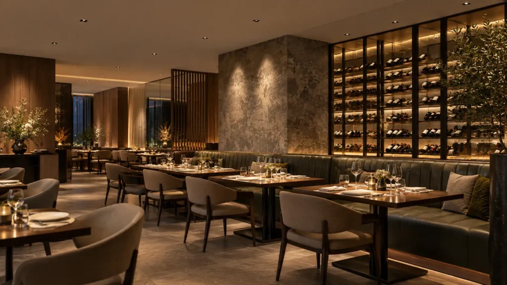
A shallow cup often shows a bright circle when someone looks up.
A deeper, darker chamber pushes the LED back.
The ceiling stays quiet. What lights up is the table, the wall, or the product.
Hotels, fine dining, boutiques, and showrooms use this because they do not want the lamp to be the brightest object in view.
On a recessed LED downlight sheet, the cup depth and inner finish are part of that picture—not an extra “tech” chapter.
The visual job is not only how the lamp looks on a cutsheet.
It is also what a guest is allowed to see when they look up.
For projects that need a quieter soffit, the fixture should stay visually secondary to the table, product or illuminated surface.
🎯 What should guests notice first—the fixture or the room?
In most hospitality and gallery work, the room, the table, or the object should read first; the head stays secondary unless you chose it as a feature.
⬜ 5. Let Geometry Follow the Building
Round is common, but LED designer downlights do not have to be round.
Round is softer. It sits easily in hotels, restaurants, most retail, and rooms that already use curves.
Square brings order. It follows straight ceiling grids, coffers, spare architecture, contemporary offices, and exhibition halls.
The useful question is not “round or square?”
It is whether the head’s geometry agrees with the ceiling, the furniture, and the rest of the interior language.
🎯 Must designer downlights be round?
No. Round or square should follow the building lines and furniture language, not a catalogue default.
🎼 6. Design the Ceiling Rhythm, not One Lamp
People often judge a single head: “Is this one handsome?”
Guests in a commercial room see ten, twenty, fifty, or a hundred.
The real design is spacing, grid vs free composition, wall-following lines, shelf-following lines, table clusters, or a deliberate irregular beat.
A strict grid feels calm and ordered—offices, retail, modern commercial floors.
Aligning to building axes can underline the architecture.
Zoning by function can give dining tables one rhythm and a display another.
Downlight design includes ceiling composition.
It is not only fixture styling.
🎯 Do you design one downlight or the whole ceiling?
You design the field. One handsome head still fails if the grid fights the walls, the tables, or the building lines.
🧩 7. Keep Fixed and Adjustable Heads in One Family
A commercial ceiling often needs general light, accent, and a wash on a wall.
If the fixed downlight and the adjustable head look unrelated, the soffit reads as an inconsistent mix of fixtures.
A cleaner move: same aperture family, same trim, same colour, similar outer diameter—different internals.
From the floor, the ceiling stays one language.
The jobs can still differ.
That is why modular families help designers: not because “modules are modern,” but because the eye reads one system.
🎯 Do fixed and adjustable heads need to look related?
Yes. Shared aperture, trim and colour keep one ceiling language while the lighting jobs still differ.
🏛️ 8. If It Cannot Hide, Make It Architecture
Some rooms have no void, a concrete soffit, or a cut-out that is not allowed.
Do not force a recessed look.
Designer surface mounted downlights—cylinders, short cylinders, slim surface cups, black / white / metal—accept that the lamp will be seen.
Then the work is proportion: diameter, height, ceiling height, spacing, and how the piece sits next to track, air, and sprinklers.
Retail, restaurants, cafés, lobbies, and exposed-concrete interiors can use that honesty.
If it cannot disappear, it has to earn its place.
🎯 What if the slab cannot take a recessed cut-out?
Use a surface piece with a diameter and drop that belong to that ceiling, rather than a recessed head that cannot sit flush.
✨ 9. Change Character with Inner Colour
You do not always redesign the whole body.
Change the reflector or inner ring, and the same head can read as a different object.
- Black reflector: deeper, quieter, more recessed in the eye.
- White reflector: easier to blend into a white ceiling.
- Gold / champagne / metal: more jewellery, more hospitality finish.
- Black body + gold chamber: a clear inner/outer layer when you look up.
Colour is not only the painted shell.
Premium downlight aesthetics also include trim, reflector, inner ring, the optical chamber, and front accessories.
🎯 Does changing the outer paint alone redesign the head?
No. Inner reflector and chamber colour often change how the fixture reads when someone looks up.
📦 10. Group Multiple Apertures into One Deliberate Ceiling Element
Sometimes the better move is not another scatter of single heads.
It is one multi-cell unit—twin, triple, or multi-aperture recessed downlights—that reads as a single ceiling element.
Three separate pinholes can look like three random dots.
One twin or triple housing can look like a composed graphic: a paired line above a reception desk, a multi-cell block over a retail display, or a controlled cluster over a dining table.
Single, double and triple apertures change the ceiling drawing in different ways:
- one aperture keeps the field calm and even
- two apertures create a stronger visual pair—useful along a counter or display
- three or more can become a deliberate block, not a spray of holes
This suits retail displays, hotel reception desks, restaurant feature zones, and other spots where you want a clear lighting mark without filling the whole soffit with scattered circles.
The design risk is the opposite: too many independent openings until the ceiling becomes a field of loose dots. Grouping apertures into one intentional element keeps the geometry readable.
Pour architect-specified downlights, keeping a consistent visual language across the project can produce a cleaner ceiling—including when multi-cell units share the same aperture and trim language as the single heads nearby.
🎯 When do multi-aperture heads help more than single dots?
When one twin or triple reads as a composed ceiling mark instead of a scatter of unrelated openings.
🧭 Match the Idea to the Interior
Use the ten ideas as a chooser, not as ten products to buy at once.
| Interior style | Downlight ideas that usually fit |
|---|---|
| Minimalist | Small aperture, trimless, white or hidden |
| Luxe | Deeper source, metal finish, a precise drawn ring |
| Modern retail | Black or graphic trim, small opening, matching adjustable heads |
| Hospitalité | Deep source, warm metals, low visual presence |
| Industrial / concrete | Surface cylinder, dark finish, honest volume |
| Galerie | Spare geometry, deep source, low presence |
Pick a column. Then stay inside it.
🎯 Should one room use all ten ideas at once?
No. Treat the table as a chooser: pick the style column that fits, then stay inside that language.
⚠️ Four Design Mistakes
All black, because black looks “high-end.”
Black only works when the ceiling and the brand already want that graphic. Otherwise it just floats.
The smallest possible hole, every time.
Mini apertures need a room scale that can support them. A vast lobby with pinholes and no other light can feel under-drawn.
One beautiful head, no ceiling order.
Spacing that ignores walls, tables, and grid lines will still look accidental.
Too many languages in one soffit.
Round, square, black, white, trimless, and cylinders mixed without a shared family usually read as accidental specification, not as design.
More decoration is not the luxury move.
One visual language usually is.
🎯 Is more design language always more luxury?
No. Mixed bezels, mixed shapes, and mixed colours on one ceiling usually look busier, not more considered.
FAQ
Conclusion
Not a prettier shell on the same disc.
It is the opening, the ring, the hidden source, the geometry, the material, the colour, the layout, and how those choices sit on the building.
Sometimes the best design is a hole that almost vanishes.
Sometimes the lamp should stay and become part of the architecture.
Every detail should serve the interior—not a fixture that looks good only in a cutsheet.
Bring Your Designer Downlight Concepts to Life with OEM/ODM Support
When a commercial project needs its own designer-downlight language, custom development can cover:
- housing and trim customization
- reflector and finish options
- fixed / adjustable modular options
- round / square structures
- OEM/ODM development for a matched series
- 5-year warranty on supported product lines
E-mail: [email protected]
Site web: www.xhlux.com