
Tabla de contenido
- What, Precisely, is 4000K Light?
- 4000K vs. 3000K vs. 5000K Light Key Comparisons
- What Are The Application Scenarios of 4000K Light?
- The Science and Psychology: More Than Just a Color
- Beyond Kelvin: Practical Considerations for Implementation
- Is The 3000K vs. 4000K Debate Becoming Obsolete?
- Conclusion: 4000K as the Intelligent, Balanced Choice
- FAQ About How to Choose Color Temperature
In the world of lighting design, few specifications are as pivotal—and as frequently misunderstood—as color temperature. You’ve likely seen the numbers on bulb packaging: 3000K, 5000K, and the increasingly popular 4000K light. But what does this figure actually mean for your home, office, or commercial space? Choosing the right color temperature is not a trivial detail; it’s a fundamental decision that profoundly impacts a room’s atmosphere, functionality, and even human psychology.
This comprehensive guide is designed to demystify 4000K color temperature. We will move beyond the technical jargon to provide a clear, human-centric understanding of what 4000K light looks and feels like. We’ll address the most common user pain point—the “4000K vs. 3000K” debate—and provide an expert-level application guide, showing you precisely where this versatile light source excels and where a different choice might be more appropriate. By the end, you’ll be empowered to choose lighting not just to illuminate, but to intentionally design your environment for productivity, comfort, and style.
What, Precisely, is 4000K Light?
At its core, 4000K light is a clear, neutral white light. The “K” stands for Kelvin, the unit of measurement for Correlated Color Temperature (CCT). As detailed by authoritative bodies like the Sociedad de Ingeniería de Iluminación (IES), the Kelvin scale describes the color appearance of a light source.
Imagine heating a theoretical black object. As it gets hotter, it first glows red, then orange, yellow, white, and finally blue. The Kelvin scale maps the color of the light to the temperature of that object.
- Lower Kelvin values (2000K-3000K) produce a “warm” light—a cozy, yellowish-orange glow similar to a traditional incandescent bulb or a sunset.
- Higher Kelvin values (5000K-6500K) produce a “cool” light—a stark, bluish-white light that mimics bright daylight.
4000K sits squarely in the middle. It has shed the prominent yellow hues of warm light but has not yet taken on the intense blue tones of daylight. The result is a balanced, clean, and vibrant illumination that is often marketed as “neutral white” or “cool white.” It feels more alert and crisp than 3000K but less clinical or harsh than 5000K.
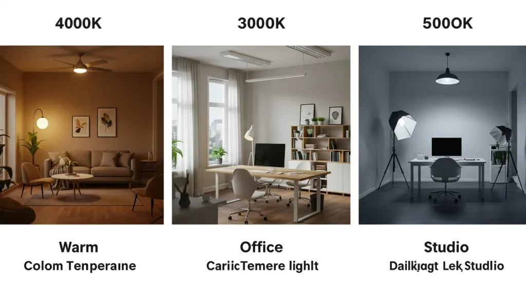
4000K vs. 3000K vs. 5000K Light Key Comparisons
The most pressing question for consumers and designers is how 4000K stacks up against its neighbors. This choice dictates the entire mood of a space. Understanding the nuanced differences is key to a successful lighting scheme.
| Característica | 3000K (Warm White) | 4000K (Neutral White) | 5000K (Daylight / Cool White) |
|---|---|---|---|
| Appearance | Soft, yellowish-white light. Inviting and cozy. | Clean, balanced white light with no discernible yellow or blue hue. | Bright, crisp white light with a noticeable blueish tint. |
| Associated Mood | Relaxing, comfortable, intimate, welcoming. | Alert, focused, clean, modern, vibrant. | Energetic, clinical, high-contrast, task-intensive. |
| Best For (Residential) | Living rooms, bedrooms, dining rooms, creating a traditional feel. | Kitchens, bathrooms, home offices, garages, basements, modern living spaces. | Task-specific areas like workshops, makeup vanities (with high CRI), utility rooms. |
| Best For (Commercial) | Fine dining restaurants, hotel lobbies, boutique retail. | General offices, modern retail, classrooms, hospitals, showrooms. | Warehouses, industrial facilities, hospitals, print shops, graphic design studios. |
| Psychological Impact | Promotes relaxation and comfort. | Enhances focus, alertness, and the perception of cleanliness. | Maximizes alertness and energy; can feel sterile if used improperly. |
Expert Insight: The trend in modern architecture and interior design is leaning towards 4000K light for functional spaces. Its neutrality complements contemporary color palettes (like grays, whites, and blues) far better than the yellow cast of 3000K, which can make modern colors appear dull or “muddy.” However, the debate isn’t about which is “better” overall, but which is superior for a specific application.
What Are The Application Scenarios of 4000K Light?
The balanced nature of 4000K light makes it exceptionally versatile. Here’s a detailed breakdown of where it performs best and why.
In the Home: A Focus on Function and Clarity
- Kitchens: This is arguably the number one application for 4000K lighting. It renders the colors of food accurately, makes countertops feel cleaner, and provides excellent visibility for chopping and other tasks. The crispness of the light creates a fresh, hygienic atmosphere.
- Bathrooms: Similar to kitchens, 4000K is ideal for bathrooms. It provides clear, shadow-free light that is perfect for grooming tasks like applying makeup or shaving. It makes white tiles and porcelain fixtures look brilliantly clean.
- Home Offices & Workspaces: If productivity is the goal, 4000K is the answer. The cooler tone helps to promote concentration and reduce eye strain during the day. It creates a professional, focused environment conducive to work.
- Garages, Basements & Utility Rooms: In these task-oriented spaces, clarity and visibility are paramount. 4000K light illuminates every corner, making it easier to find tools, do laundry, or work on projects.
- Living Rooms & Bedrooms (With a Caveat): While 3000K is the traditional choice for relaxation areas, 4000K can be used effectively in modern, minimalist designs. It is best utilized as task lighting (e.g., a reading lamp) or as part of a layered lighting scheme where it can be dimmed in the evening. Using it as the sole, bright overhead source can inhibit relaxation before sleep.
In Commercial Spaces: The Standard for Modern Professionalism
The adoption of 4000K light in commercial settings has been widespread, a trend noted by leading lighting providers like XHLUX who specialize in commercial solutions.
- Oficinas: 4000K has become the de facto standard for modern office lighting. It creates an energetic and productive atmosphere, keeping employees alert and focused.
- Retail Environments: For general retail, 4000K offers a clean, contemporary feel that makes a space seem larger and products more vibrant. It strikes a perfect balance, avoiding the overly relaxed feel of 3000K and the clinical harshness of 5000K.
- Healthcare and Clinics: The clean, white appearance of 4000K light conveys a sense of sterility, cleanliness, and professionalism, which is essential for hospitals, dental offices, and veterinary clinics.
- Classrooms and Educational Facilities: The alertness-promoting properties of 4000K lighting are beneficial for learning environments, helping to keep students engaged and focused.
The Science and Psychology: More Than Just a Color
The choice of 4000K has measurable effects on human perception and biology.
Alertness, Productivity, and Circadian Rhythm
Light is the primary signal that regulates our internal body clock, or circadian rhythm. Light with a higher blue content, like 4000K light, is effective at suppressing the production of melatonin, the hormone that makes us feel sleepy. During the day, this is a significant advantage. Exposure to 4000K light in an office or workspace can lead to:
- Increased alertness and reduced drowsiness.
- Improved concentration and cognitive performance.
- Enhanced mood and energy levels.
However, this also explains why it’s wise to limit exposure to bright 4000K light in the hours before bedtime. This is where the importance of dimmers and layered lighting comes in, allowing you to reduce the intensity or switch to warmer light sources in the evening to prepare the body for sleep.
The Crucial Role of the Color Rendering Index (CRI)
Color Temperature (CCT) tells you the color of the light itself, but it doesn’t tell you how well that light reveals the colors of objects. That is the job of the Color Rendering Index (CRI), a scale from 0-100.
This is a critical expert point: A low-CRI 4000K bulb can make a space feel dull and washed-out, and colors will appear inaccurate. For any application where color is important (a kitchen, a retail store, a makeup vanity), you must select a 4000K light source with a CRI of 90 or above. A high CRI ensures that the neutral white light is also a high-fidelity light, rendering skin tones, food, and merchandise beautifully and accurately.
Beyond Kelvin: Practical Considerations for Implementation
A common user query is, “Is 4000K too bright?” This reveals a frequent confusion between two separate metrics:
- Color Temperature (Kelvin): This is the color of the light (warm vs. cool).
- Brightness (Lumens): This is the intensity or amount of light.
You can have a dim 4000K bulb and a very bright 4000K bulb. If you find 4000K light feels “too harsh,” the issue is likely excessive brightness (too many lumens) or glare, not the color temperature itself. The solution is to choose bulbs with an appropriate lumen output for your space and, most importantly, install dimmers. Dimmers give you granular control, allowing you to have bright, functional light when needed and soft, ambient light at other times.
Is The 3000K vs. 4000K Debate Becoming Obsolete?
The most significant innovation in lighting is tunable white technology. This technology, once reserved for high-end architectural projects, is becoming more mainstream. Tunable white fixtures allow you to adjust the CCT of a single light source, typically from 2700K up to 6500K, using a remote, app, or wall control.
This makes the agonizing choice between 3000K and 4000K a thing of the past. You can set your kitchen lights to a crisp 4000K for meal prep and then tune them down to a warm 3000K for a relaxing dinner in the same space. This human-centric approach, which aligns the lighting with the activity, represents the future of interior illumination.
Conclusion: 4000K as the Intelligent, Balanced Choice
4000K light is not just a number on a scale; it is the versatile workhorse of the modern lighting world. It represents a deliberate choice for clarity, focus, and clean aesthetics. By occupying the perfect middle ground between the cozy warmth of incandescent light and the stark coolness of daylight, it provides a balanced foundation for a vast range of applications, from the most functional kitchens to the most productive offices.
Understanding how to deploy it—by pairing it with a high CRI, controlling its intensity with dimmers, and selecting it for the appropriate task—is the key to unlocking its full potential. While tunable technology may one day make fixed CCT choices obsolete, for now, 4000K neutral white remains one of the most intelligent, effective, and stylish options available for designing a truly modern space.