
جدول المحتويات
- How to Make Spaces Feel Bright Without Sacrificing Visual Comfort
- What Does Brightness Really Mean in Commercial Lighting?
- Why Too Much Brightness Reduces Comfort
- Key Factors That Affect Comfort Beyond Brightness
- Brightness vs Comfort in Different Commercial Spaces
- How Lighting Layers Help Balance Brightness and Comfort
- Common Brightness Mistakes in Commercial Lighting
- Practical Strategies to Balance Brightness and Comfort
- Why Comfort-Focused Lighting Improves Commercial Performance
- How to Design Commercial Lighting That Feels Bright but Comfortable
- Comparison Table: Brightness-First vs Comfort-First Commercial Lighting
- FAQ About commercial lighting brightness
- خاتمة
How to Make Spaces Feel Bright Without Sacrificing Visual Comfort
Many commercial projects hit their “target lux” and still fail the comfort test.
A retail store may measure high illumination levels but feels harsh. An office may look bright on paper yet triggers eye strain. A hospitality space may look premium in photos but guests describe it as “too sharp” or “not relaxing.”
The problem is usually not the number on the meter. It is the mismatch between measured illuminance و perceived brightness—and the lack of a comfort-first strategy that controls glare, contrast, and viewing angles.
This guide reframes commercial lighting brightness as visual comfort management, not merely illuminance control. You’ll learn what brightness really means, why “more light” often makes spaces worse, and how designers balance brightness and comfort across retail, hospitality, and office environments—without costly rework later.
What Does Brightness Really Mean in Commercial Lighting?
In everyday language, “brightness” means “how bright it feels.” In lighting engineering, it helps to separate three related—but very different—concepts:
- Illuminance (lux): how much light arrives on a surface.
- Luminance (cd/m²): how much light a surface sends toward the eye in a given direction.
- Brightness (perception): how the human visual system experiences what it sees—strongly shaped by contrast, glare, adaptation, and distribution.
Illuminance is objective and easy to measure. But people do not “see lux.” People see luminance patterns and experience brightness as perception.
A key technical point is that luminance describes how bright a surface will appear to an observer, while “brightness” is the subjective impression of luminance. (See the definition and context of luminance here: Luminance (photometry).)
Similarly, illuminance is the photometric measure of flux incident per unit area—useful, but not sufficient to predict comfort. (Reference: Illuminance.)
The practical takeaway
A space can be:
- High lux but uncomfortable (glare, sharp contrast, bright sources in the field of view)
- Moderate lux but perceived as bright (good vertical lighting, balanced reflectances, controlled contrast, no glare)
🎯 What does brightness mean in commercial lighting?
Brightness refers to how light is perceived by the human eye, influenced by contrast, glare, adaptation, and distribution—not just measured illumination levels.
Why Too Much Brightness Reduces Comfort
Designers and owners often “play safe” by pushing brightness higher. The intention is good: better visibility, fewer complaints about darkness, a “premium” look. But excessive brightness frequently produces the opposite result.
1) Glare: when luminance exceeds adaptation
Glare occurs when luminances within the visual field are sufficiently greater than the luminance to which the eyes are adapted, causing annoyance, discomfort, or loss in visual performance. (Definition: IES definition of glare.)
In real projects, glare is amplified by:
- Unshielded LED sources
- Shallow downlights with visible apertures
- Narrow beams aimed too close to eye level
- Over-bright fixtures combined with dark surroundings
2) Specular reflections: “bright” becomes “blinding”
In retail and hospitality, glossy floors, polished tables, glass displays, and metallic finishes can turn high output lighting into intense reflections. The lux meter may report “good levels,” but the user experiences visual annoyance and fatigue.
3) Contrast spikes: the “harsh” look
Comfort is not only about average brightness—it’s about contrast distribution. Too much brightness in small areas (like tiny, high-luminance sources) against a darker background makes eyes constantly adapt, driving fatigue.
4) Perceived quality drops
Harsh, over-bright lighting can make premium interiors feel cheap. The space looks “overlit,” textures flatten, and diners or shoppers feel exposed rather than welcomed.
🎯 Can excessive brightness cause discomfort in commercial spaces?
Yes. Excessive brightness often leads to glare, contrast stress, and visual fatigue, reducing overall comfort.
Key Factors That Affect Comfort Beyond Brightness
To design commercial lighting that feels bright but comfortable, treat comfort as a system outcome driven by three core factors:
Glare Control
Glare control is the most common missing piece. In interior spaces, discomfort glare is glare that produces discomfort without necessarily interfering with visibility. (Reference: IES definition of discomfort glare.)
In practice, glare control comes from:
- Optical shielding (deep recess, cut-off angles, baffles, honeycomb louvres)
- Source luminance reduction (better optics, diffusers, lens design—not just dimming)
- Aiming discipline (especially for track lighting and adjustable spots)
If you need a technical view on what glare calculations consider (solid angles, background luminance, source direction), Radiance’s notes summarize the common inputs used across glare metrics: Radiance glare calculation notes.
Brightness Contrast and Uniformity
Contrast can be your best friend or worst enemy.
- Controlled contrast creates focus, hierarchy, and premium atmosphere.
- Excess contrast creates stress and discomfort.
Comfortable commercial spaces typically manage:
- Brightness ratios between task and background
- Smooth transitions (no “bright dots” in dark ceilings)
- Sufficient ambient fill to prevent harsh hotspots
This is also why vertical illumination (walls, displays, vertical surfaces) often makes a space feel brighter than simply pushing horizontal lux.
Lighting Direction and Viewing Angle
Commercial spaces have different user behaviors:
- بيع بالتجزئة: standing, looking forward at products and walls
- ضيافة: sitting, long dwell time, low viewing angles
- مكتب: sustained task viewing, screens, glare sensitivity
The same fixture can be comfortable in one context and intolerable in another—purely due to viewing geometry.
🎯 What factors influence lighting comfort besides brightness?
Glare control, contrast distribution, and lighting direction/viewing angle are critical drivers of visual comfort.
Brightness vs Comfort in Different Commercial Spaces
Balancing brightness and comfort is not “one rule fits all.” The target is shaped by behavior, dwell time, and expectations.
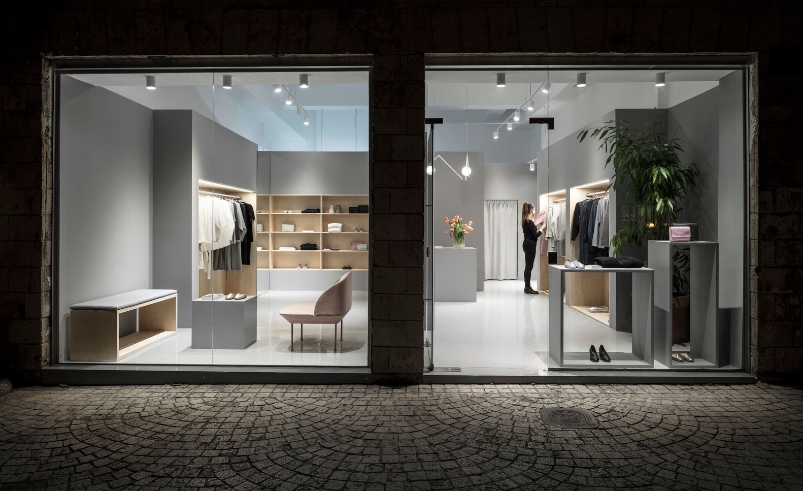
Retail Spaces
Retail often demands a brighter feel—because brightness supports:
- clarity
- product discovery
- perceived cleanliness and energy
But “full-space high brightness” is rarely the best solution. The winning strategy is usually:
- moderate ambient base
- strong, controlled accent lighting on products
- bright vertical surfaces (walls, displays)
- carefully managed glare, especially in aisles
This is where adjustable track lighting excels: you can deliver high perceived brightness where it matters (merchandise) without over-brightening the entire ceiling plane.👉 LED Track Lighting for retail and commercial accent
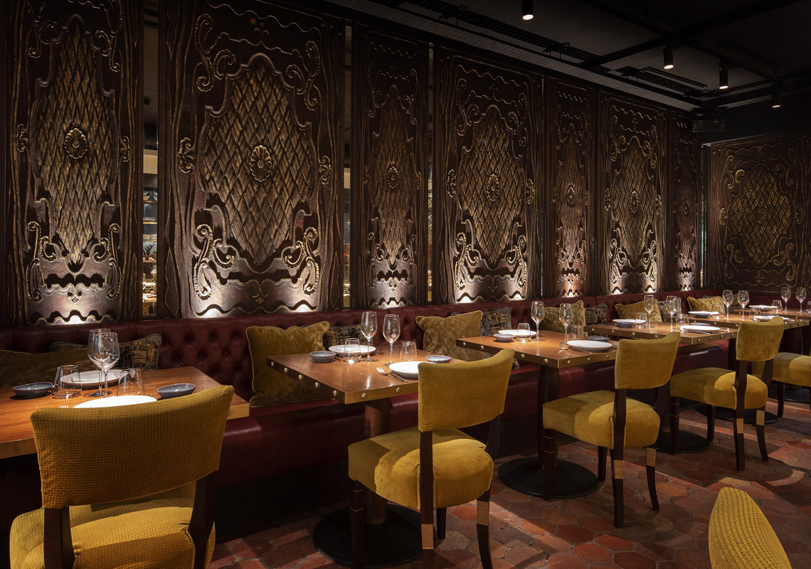
Restaurants and Hospitality
Hospitality prioritizes:
- comfort
- intimacy
- relaxed mood
Brightness here is often lower to medium—but must be structured. The biggest mistake is using high-output downlights to “guarantee visibility” and accidentally creating glare at seated eye level.
A comfort-first hospitality approach usually means:
- low-glare ambient layer
- table-focused accent
- decorative layer that enhances identity (but doesn’t do the real work)
If you’re planning hospitality projects, start from a solution mindset (zoning, layering, glare control).
👉 Hospitality & commercial lighting solutions
Offices and Workspaces
Office comfort is strongly influenced by:
- screen reflections
- sustained visual tasks
- glare sensitivity and uniformity
Offices often require higher uniformity and stricter glare control. Many workplace standards reference UGR-type glare evaluation for typical office tasks, so even “bright” offices must avoid high-luminance sources in direct view. If you want background on UGR as a concept, see: Unified Glare Rating.
In offices, brightness should come from:
- broad distribution
- high-quality optical control
- balanced vertical illumination
- stable luminance patterns (no “sparkle” ceilings)
🎯 How does brightness affect comfort in different commercial spaces?
Each space needs a tailored balance based on behavior: retail can feel brighter through accent/vertical lighting, hospitality prioritizes low-glare mood, and offices require uniformity and strict glare control.
How Lighting Layers Help Balance Brightness and Comfort
If there is one universal method to keep spaces comfortable while still feeling bright, it is layering.
Layering allows you to deliver brightness strategically instead of “turning everything up.”
Ambient layer: controls the baseline
Ambient lighting sets the general brightness level and prevents the space from feeling gloomy. But if you push ambient too high, you lose atmosphere and increase glare risk.
A strong ambient layer for commercial interiors often uses:
- deep anti-glare downlights
- concealed linear systems
- wide distribution optics
👉 LED Downlights for low-glare ambient lighting
👉 LED Linear Lighting for indirect / architectural ambient layers
Accent layer: creates focus without over-brightening
Accent lighting makes a space feel bright by making the right surfaces bright: products, tables, art, feature walls. This increases perceived brightness with less overall lumen load.
Track lighting is a practical tool here because it supports layout changes and precise aiming.
👉 Adjustable LED Track Lighting
Contrast layer: use “brightness hierarchy”
The comfort trick is not eliminating contrast—it’s controlling it. Use contrast intentionally:
- brighter on focal planes
- calmer on circulation planes
- softer transitions between zones
🎯 How do lighting layers improve comfort?
Layering distributes brightness strategically, reducing glare and contrast stress while maintaining visual interest and perceived brightness.
Common Brightness Mistakes in Commercial Lighting
Most “bright but uncomfortable” projects repeat the same mistakes:
Mistake 1: Chasing lux numbers only
Lux targets are useful—but they do not guarantee comfort. When “lux compliance” becomes the only goal, glare and luminance distribution are ignored.
Mistake 2: Using high-output fixtures with weak optics
High lumen packages combined with shallow shielding create bright apertures that dominate the visual field.
Mistake 3: Over-lighting the ceiling plane
Too many downlights make the ceiling a field of bright points, increasing discomfort and reducing perceived quality.
Mistake 4: No zoning, no scenes
Commercial spaces change throughout the day. Without zoning and scene-based control, the space can’t adapt—leading to constant “too bright” or “too dim” complaints.
🎯 What are common brightness mistakes in commercial lighting?
Excessive illumination, weak glare control, poor brightness distribution, and lack of zoning/scenes are the most common errors.
Practical Strategies to Balance Brightness and Comfort
The following strategies work across retail, hospitality, and office projects and are especially useful for risk reduction (fewer complaints, less rework).
1) Choose low-glare optics before you choose higher power
If comfort is the goal, prioritize optical design:
- deeper recess (better cut-off)
- louvres / baffles
- controlled beam edges
- proper diffusers or lenses
In real commercial builds, a comfort-first spec often includes:
- CRI > 90 (or Ra97 for premium retail/hospitality) for accurate color rendering
- SDCM < 3 for consistent color between fixtures
- High-quality drivers with flicker-conscious performance (especially for hospitality and offices)
- 100–130 لومن/واط class efficacy to balance comfort with efficiency
- Die-cast aluminum heatsink for thermal stability
- COB chip + PMMA lens or refined optical systems for smooth beam control
- Lifetime targets like L70/B50 50,000 ساعة for commercial reliability
These are not “marketing specs”—they are risk controls. Better optics and stable components reduce post-install complaints and maintenance costs.
For projects that require a strong low-glare base layer, start from downlights designed for commercial comfort:👉 Low-glare LED downlight series
2) Make vertical surfaces do the work
Walls, shelving back panels, feature displays, and branding elements drive perceived brightness. A space with bright vertical planes often feels brighter than a space with high horizontal lux only.
يستخدم:
- wall wash / grazing where appropriate
- adjustable track accents on verticals
- linear architectural lighting for continuous wall glow
3) Control reflectance and finishes (don’t fight physics)
If a restaurant has glossy tabletops and polished floors, avoid high-luminance sources directly overhead. In offices, manage screen reflections through fixture selection and placement.
4) Use beam angle and aiming rules, not guesswork
Narrow beams can create drama—but also produce glare and “hotspot stress.” Use beam angles intentionally:
- wider beams for ambient fill
- controlled medium beams for general commercial accents
- narrow beams only where viewing angles are safe and surfaces can handle contrast
5) Design zoning + scene control from day one
Brightness needs change by:
- time of day
- task mode (stocking vs shopping)
- events (restaurant dinner vs cleaning)
Scene-based control avoids the “always too bright” problem. For protocol background, DALI is widely used in professional lighting control ecosystems: DALI Alliance.
In real commercial retrofits, the fastest way to reduce complaints is often not dimming everything—but redistributing brightness:
- lower source luminance (optics)
- increase vertical brightness (walls/displays)
- reduce extreme contrast zones
- add layered accents instead of raising ambient
This approach typically improves comfort while maintaining the “bright, premium” perception clients want.
Why Comfort-Focused Lighting Improves Commercial Performance
Comfort is not just a “nice-to-have.” It is a performance driver.
بيع بالتجزئة
Comfort keeps shoppers browsing longer and reduces the “get me out of here” harshness effect. Controlled accents also improve product attention and perceived quality.
ضيافة
Comfort affects mood, relaxation, and repeat visits. Guests remember how the space felt, not how many lux were measured.
المكاتب
Comfort reduces visual fatigue and supports sustained productivity—especially in screen-heavy work environments.
Across sectors, comfort-first lighting often leads to:
- fewer complaints
- fewer change orders
- less re-aiming and rework
- higher perceived brand quality
How to Design Commercial Lighting That Feels Bright but Comfortable
Use this comfort-first checklist as a practical design workflow:
Define comfort requirements first
- user behavior, viewing angles, dwell time, reflective surfaces
Set brightness goals by perception, not only by lux
- emphasize vertical illumination and brightness hierarchy
Build the base layer with low-glare ambient lighting
- deep anti-glare downlights / indirect linear systems
Use accent lighting to create “brightness where it matters”
- track lighting and directional spots for products/features
Control contrast deliberately
- avoid extreme brightness spikes; smooth transitions
Add zoning + scene control
- day/night modes, retail refresh, hospitality mood scenes
Mock-up from real viewing positions
- seated eye level (restaurants), aisle angles (retail), desk/screen views (office)
If you want support translating these principles into a project-ready solution (fixtures + layout + beam strategy), you can route the project through your commercial solution workflow:👉 Commercial lighting solution support
Comparison Table: Brightness-First vs Comfort-First Commercial Lighting
| عامل القرار | Brightness-First Approach | Comfort-First Approach |
|---|---|---|
| Primary target | Higher lux everywhere | Perceived brightness + comfort |
| Typical outcome | Harsh, glare, fatigue | Calm, premium, balanced |
| Method | “Turn it up” / add more fixtures | Layering + vertical brightness + optics |
| Glare risk | عالي | Controlled |
| Retrofit risk | High (dimming/rework) | Lower (system designed for adaptability) |
| الأفضل لـ | Short-term “looks bright” | Long-term performance & satisfaction |
FAQ About commercial lighting brightness
خاتمة
Commercial lighting that “measures bright” is easy. Commercial lighting that feels bright and comfortable is a design discipline.
If your projects are hitting lux targets but still getting complaints, the fix is rarely “dim it down.” The fix is comfort-first brightness management:
- التحكم في الوهج
- structured contrast
- correct viewing geometry
- layered lighting
- vertical brightness strategy
- zoning and scenes
If you want help selecting fixtures and building a comfort-first brightness strategy for retail, hospitality, or office projects, start here:👉 Commercial lighting solutions & support